


As we look forward, reflecting on our evolved relationship with ‘home’, the design team at Craig & Rose has identified the most exciting colour trends for the year.
Popular choices for home decoration are heavily linked to our connection with nature and our love and fascination with the outdoors; verdant greens, tranquil blues and more rousing jewel tones are all important.
At the forefront are a wonderful selection of comforting, cocooning neutral shades varying from light to dark which provide much-needed warmth and harmony during uncertain times. Whether you enjoy sticking with a muted, minimalist scheme or are more comfortable introducing vibrant accents of colour, well-considered whites and easy-going natural shades can provide a brilliant base for an exciting and individual direction.
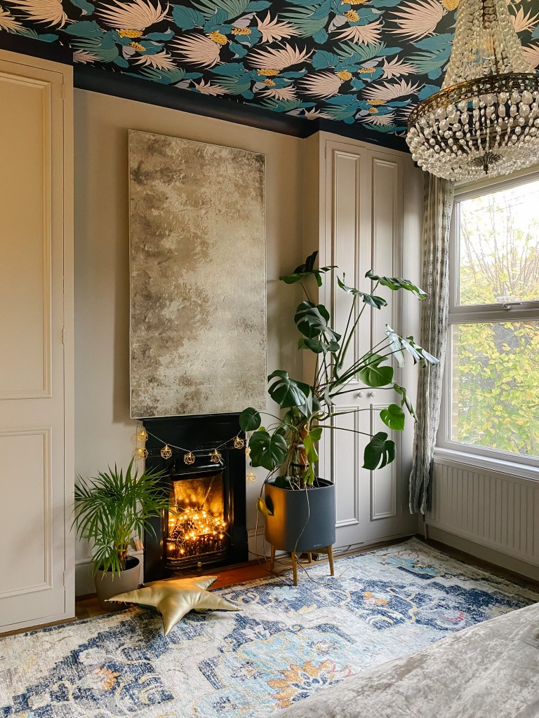
WARM SOOTHING NEUTRALS
We all require more from our hybrid homes than ever before and our multi-functional rooms need to adapt to busy lifestyles and growing families. After an uncertain period, we are in much need of familiar comfort and warmth, therefore we are enjoying a move away from cold, stark greys to more saturated, soothing neutrals. From mineral shades with pink undertones to more classic, creamy options that echo nature, opt for natural colours on all walls and introduce tonal shades and plenty of texture for an enveloping look that is timeless and reassuring.
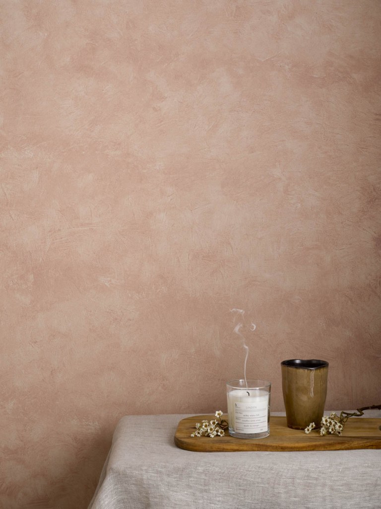
RICH EARTHY COLOURS
Once again, this colour trend echos our renewed love of warm, saturated palettes and our need for comfort. From more bold and daring tones to softer shades these earthy options are set to be big for the year ahead. Just as with greens, these colours also help to connect us with nature and can act as grounding backdrops. Select from spicier, pink-tinted shades like Venetian Red and our vibrant, terracotta colour Etruscan red, to more muted options like Light Umber to create a scheme that will work in all areas of the home. This year, mineral colours that emulate lime plaster also continue to grab attention and create stylish and cosy spaces.

SOFT MUTED PASTELS
There is always room for gentler, softer colours and these muted options help to create sophisticated interiors especially when combined with high-end finishes such as marble and metallic details. Their subtlety allows for incredible versatility so expect them to be strong choices for those looking to introduce colour into bathrooms and kitchens this year as well as being the perfect choice for a strong gender-neutral scheme. Lilac is back in the spotlight and if you have been inspired by Pantone’s announcement of ‘17-3938 Very Peri’ as their Colour of the Year for 2022 then colours such as Reverie and Tribune offer a really achievable way to incorporate this on-trend colour into your space.
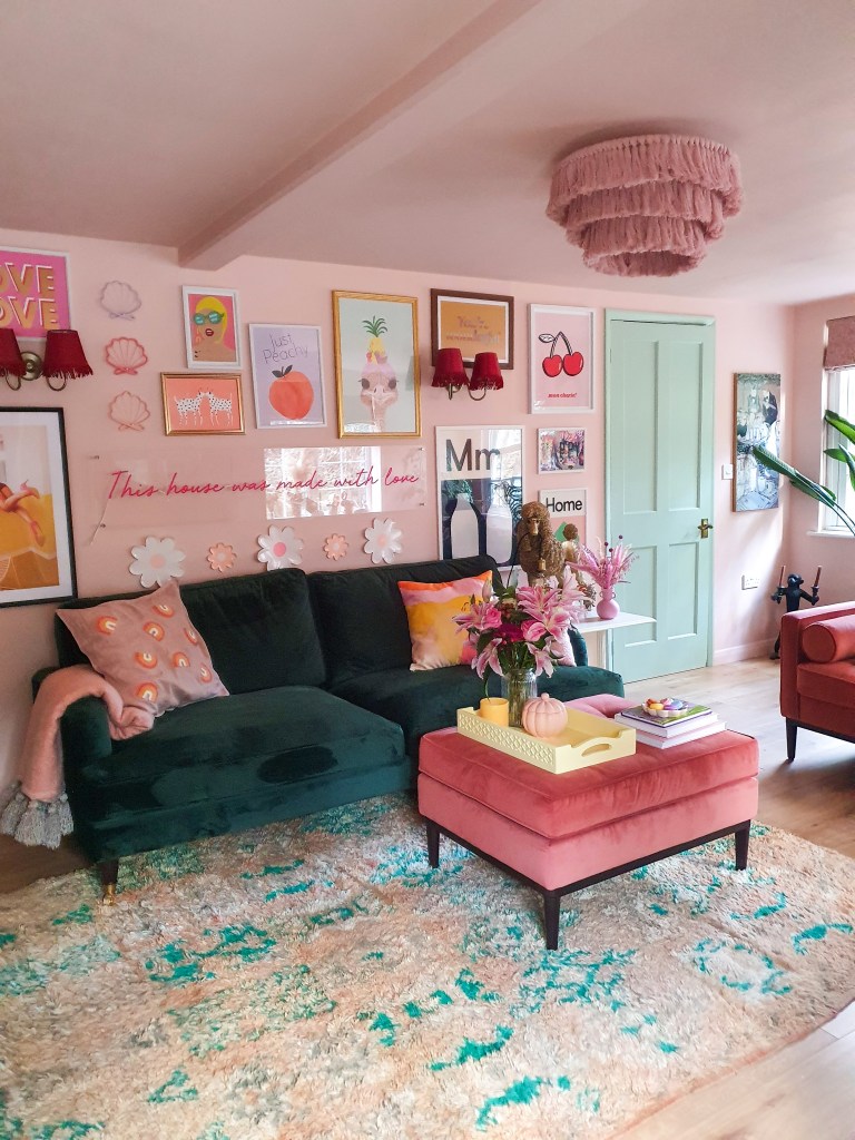
HAPPY COLOUR HIGHLIGHTS
Considering all possible surfaces for colour is one of the most interesting ways to add personality to your home. While the walls are the obvious choice – don’t forget about the ceiling and the opportunity to rethink your woodwork and doors. It’s time to play! Upcycling and repurposing furniture or getting creative with murals is an enjoyable way to express your creative side, while unexpected pockets of joyful colour or surface texture can cleverly highlight original features or zones.
About Craig & Rose
Established in 1829 by two young Scottish entrepreneurs, James Craig and Hugh Rose, Craig & Rose is one of the oldest established paint makers in the UK.
In the 1880s, Craig & Rose won the tender to paint the famous Forth Bridge and provided the paint for over 100 years. Many famous public buildings including the National Portrait Gallery, St Paul’s Cathedral and Brighton Pavilion have also been painted using Craig & Rose paints.
Craig & Rose is proud of its Scottish roots and, as well as two Scottish showrooms, the brand’s paints are manufactured in Fife.
01383 740 011 | www.craigandrose.com


